Back to all articlesUI/UX Design
Dark Mode and Accessible Design That Actually Works
Dark themes are popular—but contrast, focus states, and readability still need WCAG-minded decisions. Here is what we implement on client sites.
by Div Tag Studios Team — Design & Engineering
6 min read
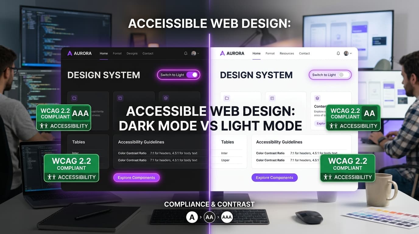
Dark mode is not just inverting colors. Accessible dark UI needs deliberate contrast ratios, visible focus rings, and hierarchy that works in low light.
- Test body text at AA contrast against backgrounds—not only headings
- Keep primary actions distinguishable from decorative purple accents
- Preserve keyboard focus indicators; never remove outlines without a replacement
- Use motion sparingly and respect prefers-reduced-motion